Previously, I highlighted three related tools provided by Microsoft that are often neglected by the accounting profession. They make extracting, cleansing and transforming data, and reporting metrics and creating powerful data visualisations so much simpler and quicker. As a reminder, these are:
Power Query (known as “Get & Transform” in Excel these days) is what is known as an extract, transform, and load (ETL) tool. This software allows you to connect to data from a variety of sources (eg, Excel files, internet data, SAP business warehouses, Access files and other databases), then manipulate it, say, by removing unnecessary data, removing additional spaces, and unpivoting elements, and finally load the tailored version of the combined files in such a way that they may be used by Excel (eg, Power Pivot) for further analysis.
Power Pivot is often referred to as “PivotTables on steroids”. You can enable it by going to File -> Options -> Add-ins -> Manage -> COM Add-ins -> Go. Checking the box for “Microsoft PowerPivot for Excel” enables the Power Pivot tab to appear on the ribbon.
Power BI, which initially referred to the entire suite of Microsoft BI tools out there, now chiefly refers to the dashboarding and reporting side of things. This is a standalone piece of software you may download from www.powerbi.com for free. Once you are satisfied with what you have created, you can publish your dashboard or reports to the cloud using Power BI Service and share them with the world.
As an introduction in the previous article, I provided a useful tip for demonstrating the power of Power Query. This time, I continue the theme, with several demonstrations of what Power Pivot and Power BI can do for you as well. Don’t stop with just these suggestions though: There are many more useful tips you can discover as you become more familiar with the triumvirate. Just keep using the software!
Creating more powerful PivotTables
It’s pretty easy to create a PivotTable (see the screenshot “Example PivotTable,” below).
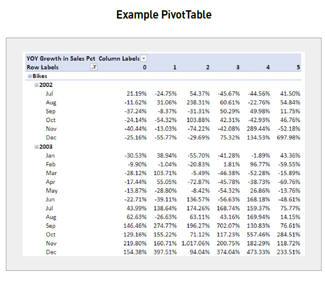
But look closer. This uses Microsoft’s AdventureWorks Cycles database (hence the years are a little old), but do you see what is being reported? It is year-on-year sales growth by month for a particular product (bikes), analysed by how many children the customer has at home. Would anyone ever want to retain all that information in one table that could be used as the source for a PivotTable?
In the past, I would have humbly suggested the answer is “no”. You’d need your main (“factual”) table detailing the sales and then some lookup (“dimension”) tables detailing the precise product sold and further details about the customer the sale would be made to. Think of a “fact” table as one where you have the data you wish to analyse and your “dimension” tables as the data sets you “VLOOKUP” other data from.
However, in Power Pivot, you can import all the tables and connect them just by importing them, going to Diagram View, and simply dragging one field to its pairing in another table, thus avoiding clunky VLOOKUPs or a raft of INDEX MATCH or XLOOKUP formulas (see the screenshot “Diagram View in Power Pivot,” below). Unfortunately, it should be noted that the fields that are linked do not highlight unless the link between the tables is clicked on.
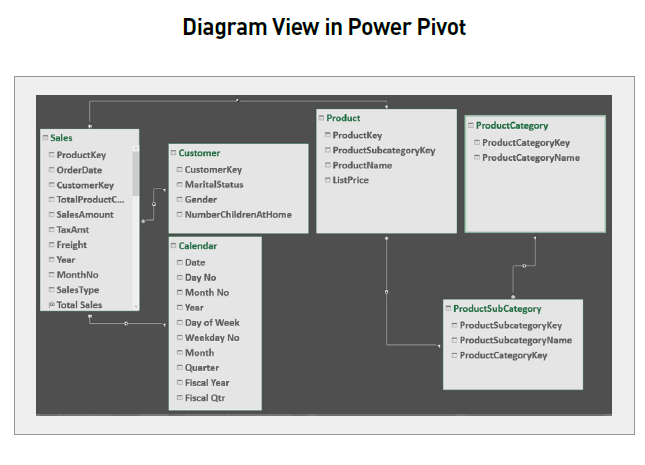
You can’t do that in PivotTables. It’s simple — the tables are just loaded into the software, and then you simply drag the fields across to their counterparts to link them. Power Pivot only supports what is known as “one to many” linking, but don’t worry if you are unsure what this is. Power Pivot knows and will link data tables together the correct way round to ensure your VLOOKUP-type links work as expected.
Easy reconciliations
Imagine you had two data tables — it could be your bank statement and a spreadsheet — and you wanted to perform a reconciliation. Here, let’s have “Revenue” and “Cost” Excel Tables (see the screenshot “Revenue and Cost Excel Tables,” below).
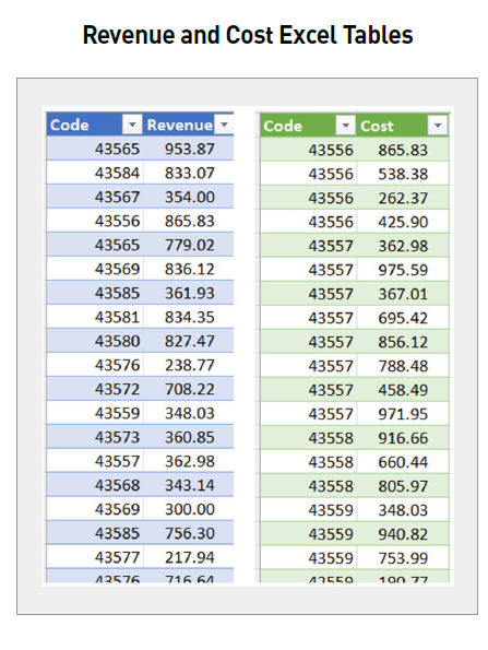
Do you see that both use a five-digit code number? I want to see which items do not reconcile. Yes, this could be performed with COUNTIF formulas in Excel, but again, manual manipulation is required.
An alternative is to both merge and append tables:
- Merging is when columns (fields) from one table are added to another (this requires a field that can be used to identify which rows match).
- Appending is when rows (records) from one table are added to another (this requires the tables to share the same field names).
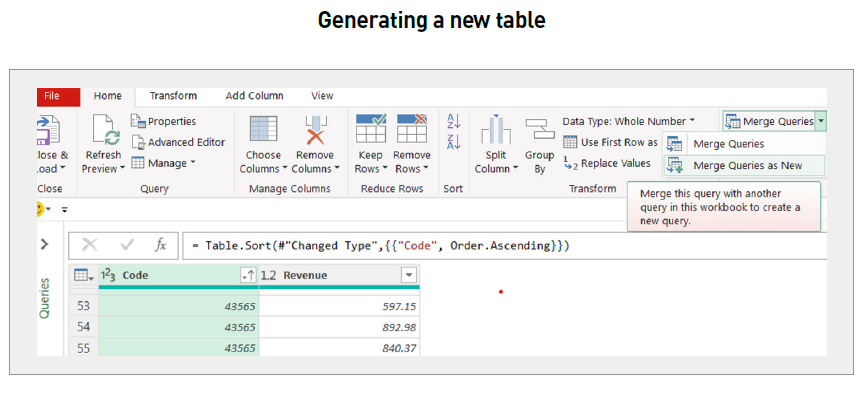
The first thing is to import both Excel Tables into Power Query. Once there, select one of the tables (say Revenues and then click on the Merge dropdown on the Home tab and click on “Merge Queries as New” (to generate a new table rather than merge with an existing one) — see the screenshot “Generating a New Table,” below.
This gives rise to the Merge dialog box, where the two tables and fields may be selected (see the downloadable screenshot “Merge Dialog Box”).
There are several join kinds (shown in the downloadable screenshot “Merge Dialog Box”); the one required is the Left Anti — this creates a table where records in the top table do not have a corresponding item in the second table (ie, they cannot be reconciled). Clicking OK creates the result shown in the screenshot “Merged Table Result,” below.
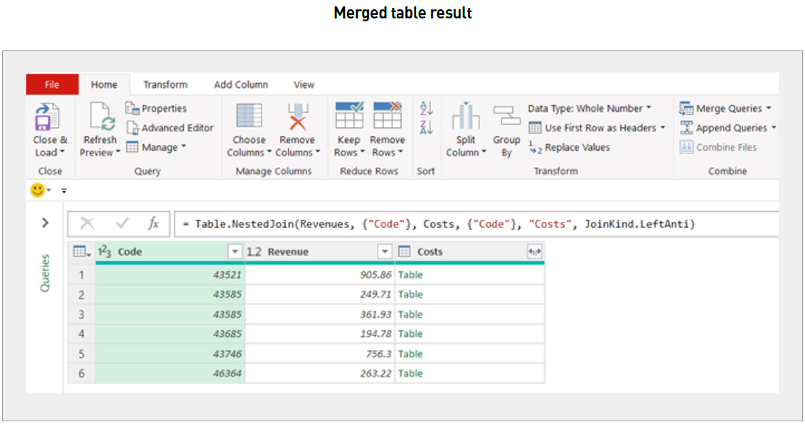
Notice the rows in the final column say “Table” (in green). This means Power Query cannot display all the fields in one column. However, note there is an icon () to the right of the final field header. Clicking on this and selecting the correct fields generates the table as shown in the screenshot “Generating the First Part of the Table,” below).
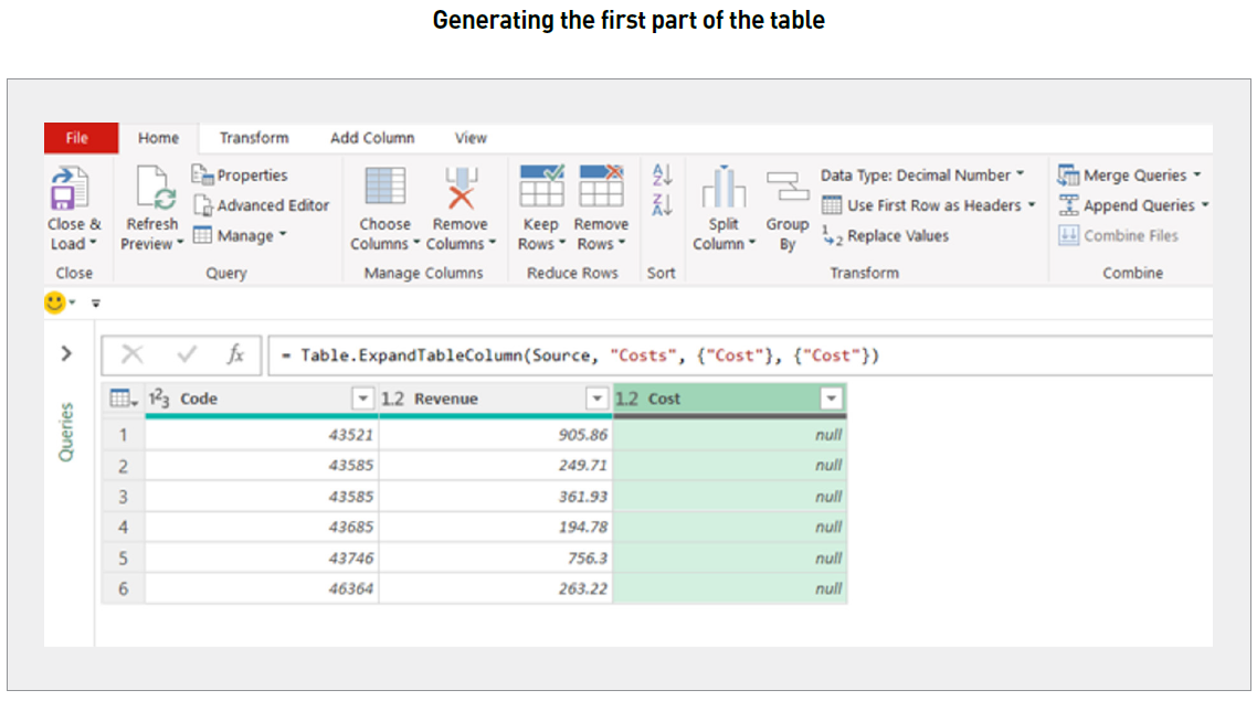
We have the first part of the table, and this query should be saved. Repeating this entire process starting in the Costs query creates the other half of the reconciliation — this time, rows in the second table, not in the first.
Appending and then closing and loading the appended query will produce a final report (see the screenshot “Final Report,” below).
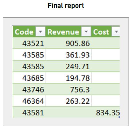
This might be an involved process, but again, it only has to be performed once — only refreshing will be required for future reconciliations. Tedious tasks have become a thing of the past.
Creating a chart instantly
You can create a dashboard intuitively and efficiently by loading the data into Power BI Desktop (similar to how it is done in Power Query) and using the charting tools (see the screenshot “Creating a Dashboard,” below).

If you want to create a chart to answer a question, it is so easy. Simply click on an empty area of the dashboard and then click on the Q&A icon in the Visualizations pane (see the downloadable screenshot “Using the Q&A Icon in the Visualizations Pane”).
Type your question in the speech bubble that appears and watch as your chart appears by magic (see the downloadable screenshot “Creating a Further Chart”). Here, I have asked for the graphical analysis of “yearly income by birth date” (the wording may seem a bit “clunky”, but Power BI understands the question).
That’s it!
Quick Insights
There’s another showstopper in Power BI. First, create your chart in Power BI Desktop. Once happy, click on Publish on the Home tab. This will “post” the file to the Power BI Service (see the downloadable screenshot “Publish on the Power BI Service”). This is the Cloud-based Power BI offering where you can choose who you share the report with (it is never shared publicly by default).
Once the file has loaded, you have the option to access Quick Insights immediately within your login area of the Cloud (see the downloadable screenshot “Option to Get Quick Insights”).
Clicking on the “Get Quick Insights” hyperlink will generate key insights identified by the Power BI Service (see the screenshot “Quick Insights Example,” below).
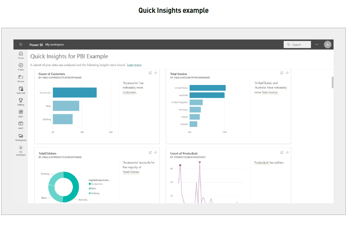
Obviously, the insights will depend on the quality of the data. However, with many linked data tables, it is easy for an analyst to miss relationships, correlations, and outliers in the data that Power BI, quite simply, won’t. Let it do some of the heavy lifting for you.
I must confess that I use this last tip all the time. When I have unfamiliar data, I create rudimentary charts in Power BI (what they depict is often irrelevant) in order to use the Quick Insights feature. This provides me an understanding of structure, key trends, and outliers in seconds. It’s definitely worth the diversion.
Word to the wise
With this article and the previous one, hopefully you can now see just how the Power BI suite of tools can make your life easier. I hope I have your interest piqued. Too often we spend 95% of our time preparing data and only 5% of our time analysing the resulting information. It’s time to swap those two percentages: work smarter, not harder.
Liam Bastick, FCMA, CGMA, FCA, is director of SumProduct, a global consultancy specialising in Excel training. He is also an Excel MVP (as appointed by Microsoft) and author of Introduction to Financial Modelling and Continuing Financial Modelling. Send ideas for future Excel-related articles to him at liam.bastick@sumproduct.com. To comment on this article or to suggest an idea for another article, contact Oliver Rowe at Oliver.Rowe@aicpa-cima.com.


