Ideas is an artificial intelligence-powered insights service that facilitates data analysis in Excel. It helps users create professional documents, presentations, and spreadsheets in less time, providing customised suggestions for outliers and insights when called upon. It is especially useful when you are overwhelmed with data and need to turn it into information, knowledge, and wisdom. It’s not in all versions of Excel, though; presently, it is only available in Excel for Office 365, Excel for Office 365 for Mac, and Excel for the web. But don’t let that put you off: This is a taste of the future of Excel.
For example, Ideas helps identify trends, patterns, and outliers in a data set, facilitating data analysis in seconds and empowering you to understand data through high-level summaries, PivotTables, PivotCharts, and other visualisations. Simply click a cell in the given data range, and then click the Ideas button on the Home tab. Then, Ideas will analyse your data and return preview visualisations of insights in the task pane.
But it goes further than that. You can also obtain suggestions and insights from Ideas by directly asking questions about the data in the task pane. Supported by the technology known as natural language processing (NLP), Ideas aims to aid the interaction between computers and humans to understand natural language. No more technical gobbledegook required.
One requirement for Ideas is that the data be in a contiguous table, with headings in the first row. You don’t have to have an Excel Table, though creating one does ensure that subtotals and totals are not treated as line items.
Let’s use an Excel Table to demonstrate Ideas at work. For this example, suppose we have a Table with Sales by Year, Category, and Brand:

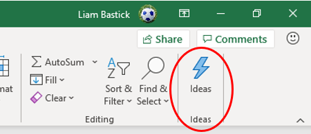
To generate Ideas, select one or more cells in the data set, then from the Home tab, click Ideas. You should note that you always need an internet connection, but if it’s your first time, you will need to turn on Intelligent Services, too. This can be done simply by clicking on the Ideas button:
Depending upon your security settings and whether you have used Ideas before, you may encounter the following dialog:

If you do see this interface, you may obtain rather uninteresting output if you don’t turn on the Intelligent Services.
You will then see a list of suggested charts of trends, outliers, correlations, and PivotCharts, based upon your data with the chart type automatically chosen and the axes, labels, and titles all filled in. You can simply click on the + Insert Chart (or + Insert PivotChart) button below each chart to add the Ideas to the workbook.

From the visualisations provided, you may select charts to insert with the titles and legends populated automatically. If you want to make changes to these charts, you just make the changes as if you had created the chart yourself. The normal procedures of adjusting the formatting and data set may be adopted here. This allows you to dig into the charts in more detail.
For example, if the graphic is a PivotChart, it will create a new spreadsheet tab showing the filtered data the PivotChart is based upon. This makes it easy to modify the PivotChart fields in the task pane and try different combinations of fields to see what else may be gleaned regarding the selected data.
In addition to getting recommendations from Ideas, users may also ask questions about the data directly in the Ideas task pane. All you need to do is type a question in the text box in the task pane. Ideas is powered by an NLP model using the Azure Machine Learning (ML) service. It’s a shame that explanation is not in a natural language, but it does mean Ideas is quite clever. If you simply click in the text box at the top of the Ideas pane (ie, you don’t even type anything), a list of suggested descriptions and graphics regarding the data will be displayed:
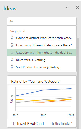
How great is that? Or you can go for broke and actually decide to type a question (or topic):
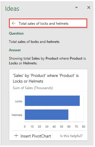
In this case, I’ve typed in the description “Total sales of locks and helmets.” Ideas returns the chart under the text box, which shows the total sales for locks and helmets and asks if it’s helpful. I think so. Yes, the chart title is full of single quote marks and appears to have been written by a lawyer charging by the word, but it’s been generated automatically.
On the face of it, Ideas may seem similar to the Quick Analysis Tool, readily accessible by highlighting your data set, as shown below.
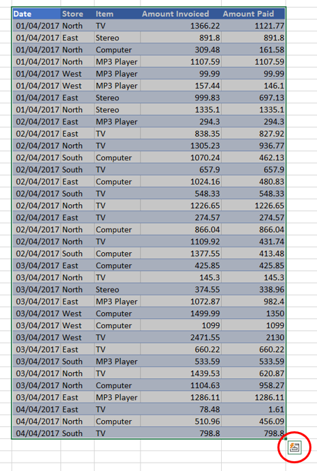
Clicking on this tool, you can select Recommended Charts:
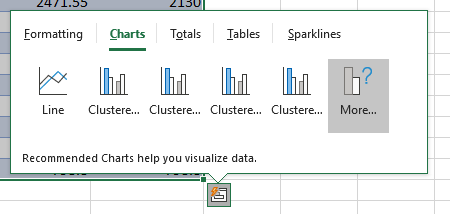
From here, you can select certain insights:
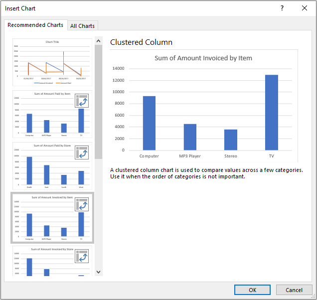
This approach provides more basic analysis and offers no opportunity to ask questions, but it does provide insight into how Ideas fits into the family of Excel’s data analysis tools. It’s true that Ideas may currently have only a limited number of suggestions or insights available, but it’s an excellent way of obtaining useful information out of a data set, on an interactive basis using natural language queries, in seconds.
Word to the wise
There are several points to note:
- Depending upon the data set, you might obtain multiple results for some insights and some useful groupings for organising the data set. If you wish to obtain more suggestions than the ones presented, it’s worth clicking through to review each individual visualisation.
- It should be noted that Ideas works best with data in a tabular format in an Excel table. The more correlations and relationships there are in the data set, the more insights are likely to be returned. More correlations and relationships will grant Ideas more opportunities to group the data and find interesting insights such as correlations, trends, and patterns. Currently, Ideas can identify highlights in initial stage:
- Rank: Specific items that are significantly larger than others;
- Trend: A steady trend pattern over a time series of data;
- Outlier: Unusual results in data organised by time series or correlated with other associated data; and
- Majority: Majority of a total value can be attributed to a single factor.
- The Ideas task pane is not dynamic. If you edit the original data set or choose a different table to get insights on, you should click the Ideas button again to generate new recommendations.
- Chart formatting may not match any Color Themes already set in your workbook, which can be a little frustrating. However, any PivotTables inserted will follow these said colour schemes.
- Currently, Ideas may not work on some data sets for the following reasons:
- Ideas doesn’t currently support analysing data sets with over 1.5 million cells.
- Ideas doesn’t currently support analysing data sets over 16MB, which is approximately 250,000 cells, depending upon their content.
- Proper date serial numbers are required for Ideas to identify dates. Dates entered as text will be analysed as if they are text strings.
- Ideas only works with .xlsx, .xlsm, or .xlsb file types. If your file is .xls (or another type), use Save As to save it as one of the compatible file types.
- Unique column headers are required. Merged cells are not understood well by Ideas.
- Perhaps not of concern to US readers, dates are formatted mm/dd/yyyy, regardless of your regional settings. This may be modified once you add the chart or PivotChart to your workbook. Just edit the chart in the usual manner and then type in the date format required.
- In order to make Ideas work optimally on your data set, consider:
- Filtering or grouping your data to reduce the dimensions, then copy and paste this revised table elsewhere and try Ideas on the smaller data set.
- Always making sure the data type is correct. For example, if the field is a date, then make sure the data type is date or date/time.
- Always making sure the file type of your workbook is .xlsx, .xlsm, or .xlsb.
- Removing all merged cells, then formatting the cells using Center Across Selection by adjusting the settings in Alignment -> Horizontal -> Center Across Selection. Also avoid header rows spread over two or more rows.
— Liam Bastick, FCMA, CGMA, FCA, is director of SumProduct, a global consultancy specialising in Excel training. He is also an Excel MVP (as appointed by Microsoft) and author of Introduction to Financial Modelling. Send ideas for future Excel-related articles to him at liam.bastick@sumproduct.com. To comment on this article or to suggest an idea for another article, contact Jeff Drew, an FM magazine senior editor, at Jeff.Drew@aicpa-cima.com.


