


Over the years, I have been asked why I don’t write more on charting tips and tricks in Excel. In the past, such topics were awkward to write, as it really depended upon which Excel version you had in order to create and manipulate said charts. You’d need one set of instructions for Excel 2000, another for Excel 2003, another for Excel 2007, and so on. And that was before you even considered Mac alternatives.
But then the situational pendulum swung from one extreme to the other. Charts became really, really easy.
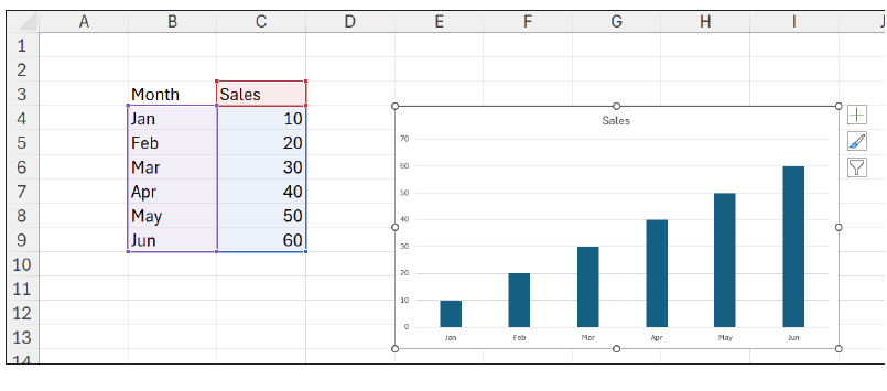
Yes, there had always been the keyboard shortcut ALT+F1, which inserted a simple chart into the worksheet — see the screenshot “Inserting a Simple Chart”.
Inserting a simple chart
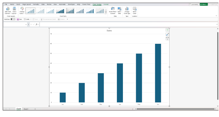
Or, alternatively, you had F11, which placed a similar chart on an Excel chart sheet instantly — see the screenshot “Inserting a Simple Chart on an Excel Chart Sheet”.
Inserting a simple chart on an Excel chart sheet
But it was simpler than that. With the advent of Excel 2013, suddenly from having no related command or chart wizard you had “Recommended Charts”. The problem is, very few analysts seem aware of its existence. I stopped writing about charts because they had become so simple, not realising many Excel users were oblivious to this feature’s existence.
I need to put this right.
They say a picture tells a thousand words. If you are trying to turn your data into information, we often revert to the pictorial — and there’s no better place to start than using charts. Recommended Charts in Excel will suggest the best chart type(s) for your data, based upon the context, message, and trends you wish to convey.
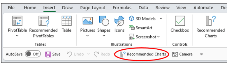
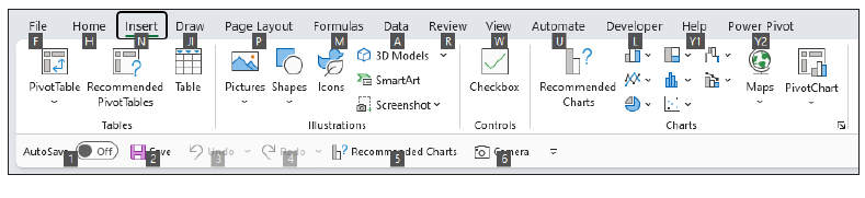
There are several ways to access this tool. One way is to highlight your data and then click the Recommended Charts button in the Charts grouping of the Insert tab on the Ribbon (see the screenshot “Accessing Recommended Charts Via the Ribbon”).
Accessing Recommended Charts via the Ribbon

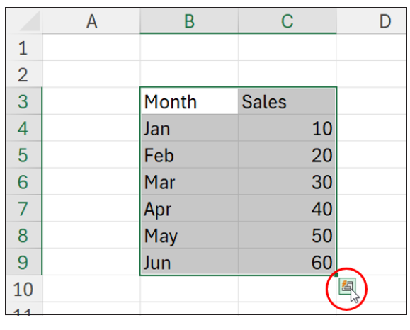
Another way is to use the Quick Analysis feature (CTRL+Q), which appears when you select the data (see the screenshot “Using the Quick Analysis Feature”).
Using the Quick Analysis feature
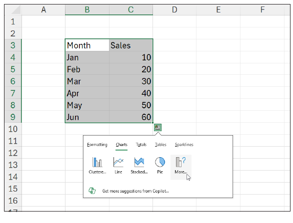
In the resulting interactive ToolTip pane, you should select Charts from the tab and then More… as the final option (see the screenshot “Using the Quick Analysis Feature — Second Stage”).
Using the Quick Analysis feature — second stage
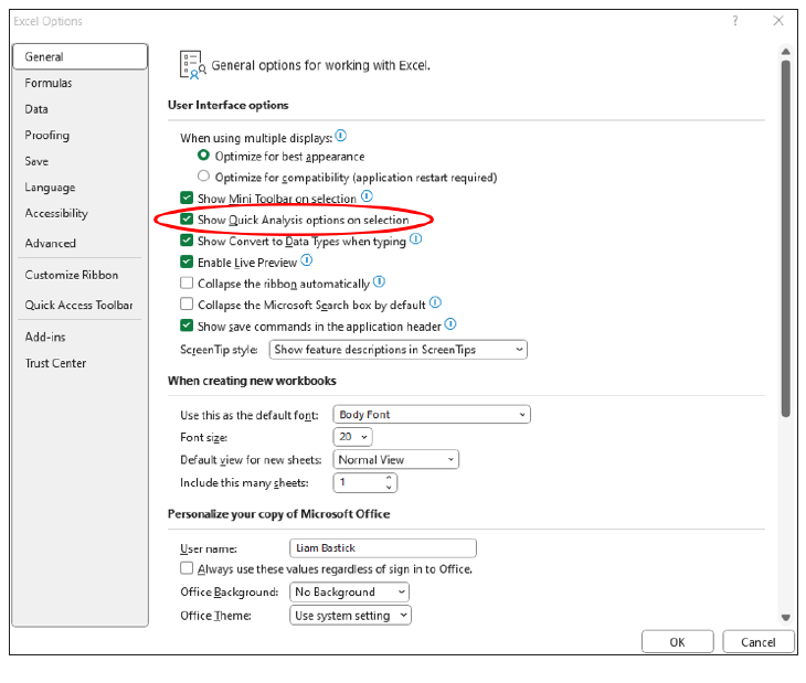
If the “Quick Analysis” feature does not appear for you, you will need to go to Excel’s options (either File -> Options or ALT+F+T) and ensure in the General section under User Interface options that “Show Quick Analysis options on selection” is checked — see the screenshot “User Interface Options”.
User Interface options
Eagle-eyed readers will have noticed that in my earlier screenshots I had Recommended Charts on my Quick Access Toolbar, too (mine is displayed below the Ribbon and may appear differently to others, as I am using Excel Insiders: Beta as my version of the software) — see the screenshot “Recommended Charts on the Quick Access Toolbar”.
Recommended Charts on the Quick Access Toolbar
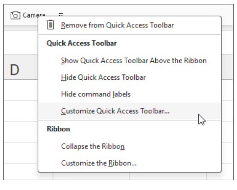
To get this button onto your toolbar, simply right-click on a pre-existing button on this bar and select Customize Quick Access Toolbar… (see the screenshot “Select Customize Quick Access Toolbar”).
Select Customize Quick Access Toolbar
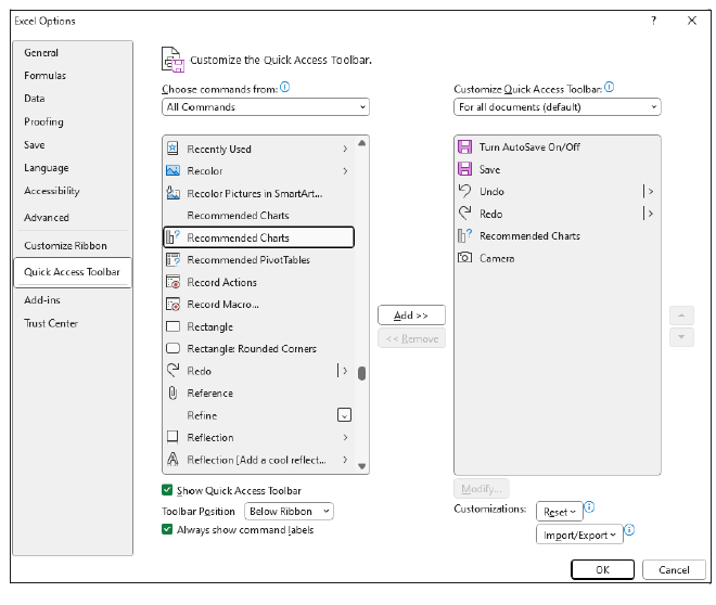
In the resulting dialog box, select All Commands from the Choose commands from: dropdown menu and then scroll down and Add>> the Recommended Charts option (I use the second one with the icon) — see the screenshot “Adding Recommended Charts to the Quick Access Toolbar”.
Adding Recommended Charts to the Quick Access Toolbar
The advantage of having this on my Quick Access Toolbar is that I have a very quick shortcut to it (in my case, ALT+5) — see the screenshot “Shortcut to Recommended Charts”.
Shortcut to Recommended Charts
Whichever way you elect to access Recommended Charts, you should come to the Insert Chart dialog box and open on the Recommended Charts tab — see the screenshot “Insert Chart”.
Insert Chart
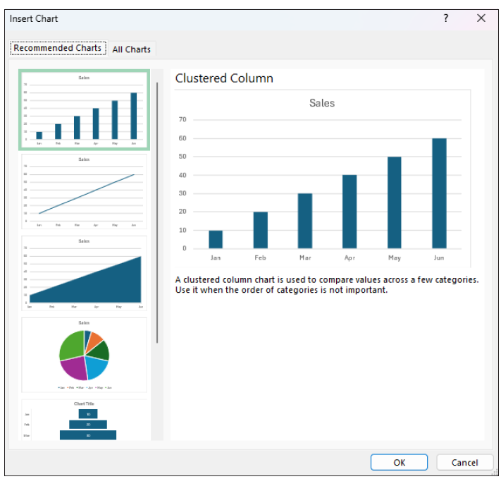
Excel will then display a gallery of charts it deems are suitable for your data. You may preview them in the dialog box before clicking OK to insert the preferred one into your worksheet.
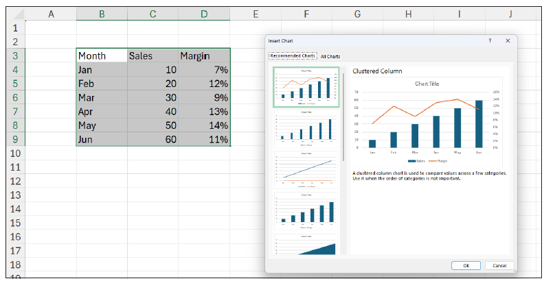
These recommendations will vary depending upon your data. As an example, see the screenshot “Clustered Column”.
Clustered Column
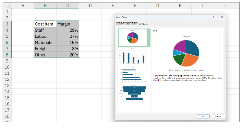
Or, see the screenshot “Pie Chart Example”.
Pie chart example
You may need to format the resulting charts slightly and amend colour palettes or themes, but you get the picture — quite literally.
Recommended Charts have several advantages for data analysis, financial reporting, and presentations. These include:
- They may be produced instantly, saving you time and effort.
- The feature has been programmed to choose the most appropriate visualisations, benefiting your data without having to create them manually.
- They provide a vital communication tool — summarising your data, providing information, and highlighting key trends, patterns, and concerns.
- They improve your visualisation skills as you realise there is more to life than Pie charts — and show you how different chart types may emphasise the key message you wish to convey.
Of course, there are “areas for improvement”, too:
- The charts provided may not always be accurate or relevant, as they rely on computational algorithms that may not detect the subtleties, nuances, or specifics of your requirements.
- Some charts produced may not be fully flexible or customisable, such as adding/removing or reordering categories.
- The feature may not support complex, multidimensional datasets over several worksheets.
- The results will not always be sufficient (and certainly not comprehensive). Some chart types are not necessarily considered, for example, box plots, histograms, sparklines, and waterfall charts.
Word to the wise
Despite their limitations, Recommended Charts should always be explored as a “first option” to provide you with ideas and improve your data analysis/visualisation skills. They can provide simple charts to convey your message appropriately and also help you avoid common mistakes such as choosing clearly wrong visuals (eg, Pie chart for time series analysis).
Just like all things in life, never rely on Recommended Charts as the final word in data visualisation, but it certainly does help improve your pictorial vocabulary.
Liam Bastick, FCMA, CGMA, FCA, is director of SumProduct, a global consultancy specialising in Excel training. He is also an Excel MVP (as appointed by Microsoft) and author of Introduction to Financial Modelling and Continuing Financial Modelling. Send ideas for future Excel-related articles to him at liam.bastick@sumproduct.com. To comment on this article or to suggest an idea for another article, contact Oliver Rowe at Oliver.Rowe@aicpa-cima.com.
LEARNING RESOURCES
Microsoft Power BI: Power BI Series
This nine-part self-study online series was created to help you develop the skills necessary to use Microsoft Power BI tools.
 COURSE
MBAexpress: Presenting Financial Information — V 2.0
This course discusses the basic steps to developing a process that effectively delivers numbers-oriented information to nonfinancial audiences.
COURSE
AICPA & CIMA MEMBER RESOURCES
Articles
“How to Use Data Tables in Excel”, FM magazine, 11 November 2024
“How Excel Builds on Basic Principles to Assist Forecasting”, FM magazine, 28 August 2024
“6 Ways to Create Scalable Financial Models in Excel”, FM magazine, 21 June 2024