How can finance functions add more value? It’s a challenge accountants and finance professionals in business and industry increasingly face.
One way to boost efficiency and productivity is by speeding up financial root cause analyses with artificial intelligence (AI) tools in data analytics software Microsoft Power BI. These tools can do in minutes what takes hours with Microsoft Excel. But switching gears can be daunting, so here’s an interactive, step-by-step example to get you started.
Imagine we’re accountants in the finance department of Pro Flight Grips Inc., a fictitious company that manufactures grips for recreational products for customers across North America. The company has three product lines — plastic, cord (rubber with cord fabric for moisture absorption), and regular (rubber) — and it manufactures and sells the following products: golf grips (full-cord, half-cord, and cord grips for putters; regular swing club grips; and grips without seam), ski handles, and tennis racket grips.
While preparing financial statements for top management, we notice a significant drop in sales in a month that typically shows more robust demand. How do we quickly determine the underlying cause of this problem in anticipation of management’s questions?
Historically, this question might have taken hours or days to investigate. Now, data analytics assisted by AI can quickly provide a summary and detailed analysis in a fraction of the time.
In the example of Pro Flight Grips, we identify possible causes at a high level with the help of Power BI’s AI “Analyze” feature, then investigate further at detailed levels using Power BI’s “Decomposition Tree”. We include the use of Power BI’s “Key Influencers” to determine possible means of recovery and conclude with the use of the “Smart Narrative” feature to quickly summarise various findings.
While this article uses the AI capabilities found in Power BI, other data analytic products such as Tableau, MicroStrategy, and Qlik may work as well.
Getting started with Power BI
In a real-life scenario, we would start the analysis by importing data into Power BI (see how in the March 2020 Journal of Accountancy article “Power BI: An Analytical View“). To follow along in this walk-through, do the following:
- Download the file “Power BI Income Statement Data Example.pbix” from this page.
- Open Power BI Desktop. (A free version of Power BI Desktop is available, if necessary.)
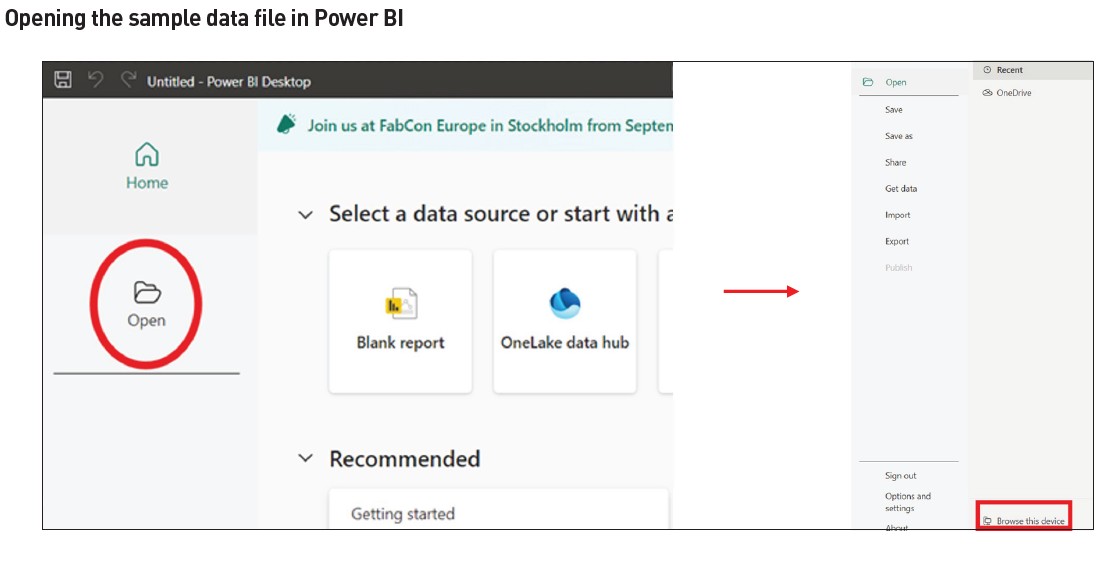
- Open the sample data file.
- Click the “Open” icon (shown in the red circle in the screenshot, “Opening the Sample Data File in Power BI”).
- Find and open the downloaded Power BI file. To do so, look at the bottom of the “Open” section and click “Browse this device” (shown in the red box in the screenshot “Opening the Sample Data File in Power BI”) to access the file explorer.
Problem identification
Step 1: Data review
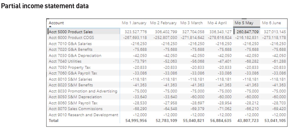
Upon opening the Power BI file, the income statement data appears as loaded in a matrix visualisation (see the screenshot “Matrix Visualisation With Income Statement Data”).
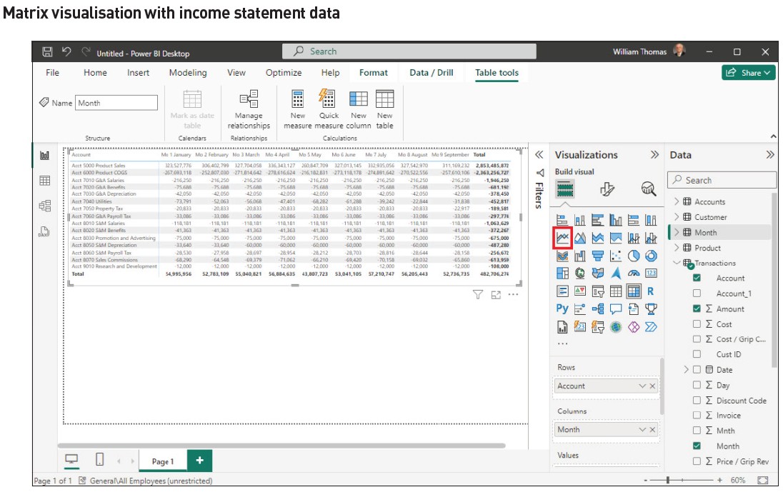
To better examine the income statement data, a portion of the visualisation (see the screenshot “Matrix Visualisation With Income Statement Data”) has been included and enlarged due to the limited size shown in the screenshot. (See the screenshot “Partial Income Statement Data”.)
Step 2: Analyze sales
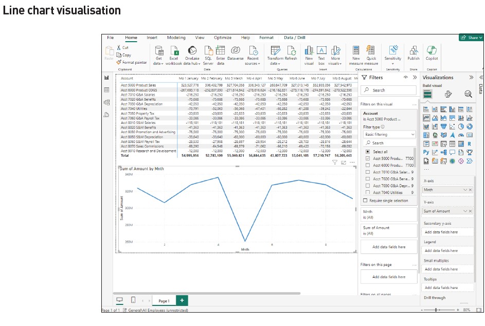
To conduct a quick analysis of sales, create a line chart visualisation of product sales by month.
Here’s how:
- Click on an open space in the Power BI canvas area (the blank space below the income statement as shown in the screenshot “Matrix Visualisation With Income Statement Data”).
- Click on the line chart visualisation icon outlined by the small red box (see the screenshot “Matrix Visualisation With Income Statement Data”).
- From the “Data” pane, left-click and drag the “Mnth” field (located in the “Transactions” table) and release it in the “X-axis” cell located in the “Visualizations” pane.
- Left-click and drag the “Amount” field and release in the “Y-axis” cell.
- Left-click and drag the “Account” field and release it in the “Filters” pane in the “Add data fields here” under the “Filters on this visual” block.
- Under “Filter type” select “Basic filtering” and select “Acct 5000 Product Sales”.
The resulting line chart shows a significant decline in month 5, which is May. The line visualisation tool in Power BI prefers to use month numbers on the axis. (See the screenshot “Line Chart Visualisation”.)
‘Analyze’ feature
Step 1: Investigate the decrease in sales
To determine the cause of the sales drop, we first turn to Power BI’s “Analyze” feature — the fastest and perhaps most powerful AI tool in Power BI.
To “Analyze” factors affecting sales:
- Scroll over the point designating Month 5, right-click on the point, then left-click on “Analyze” (as shown in the leftmost red box in the screenshot “Line Chart Visualisation: Month 5 Observation”).
- Left-click on “Explain the decrease” (as shown in the rightmost red box in the screenshot “Line Chart Visualisation: Month 5 Observation”).
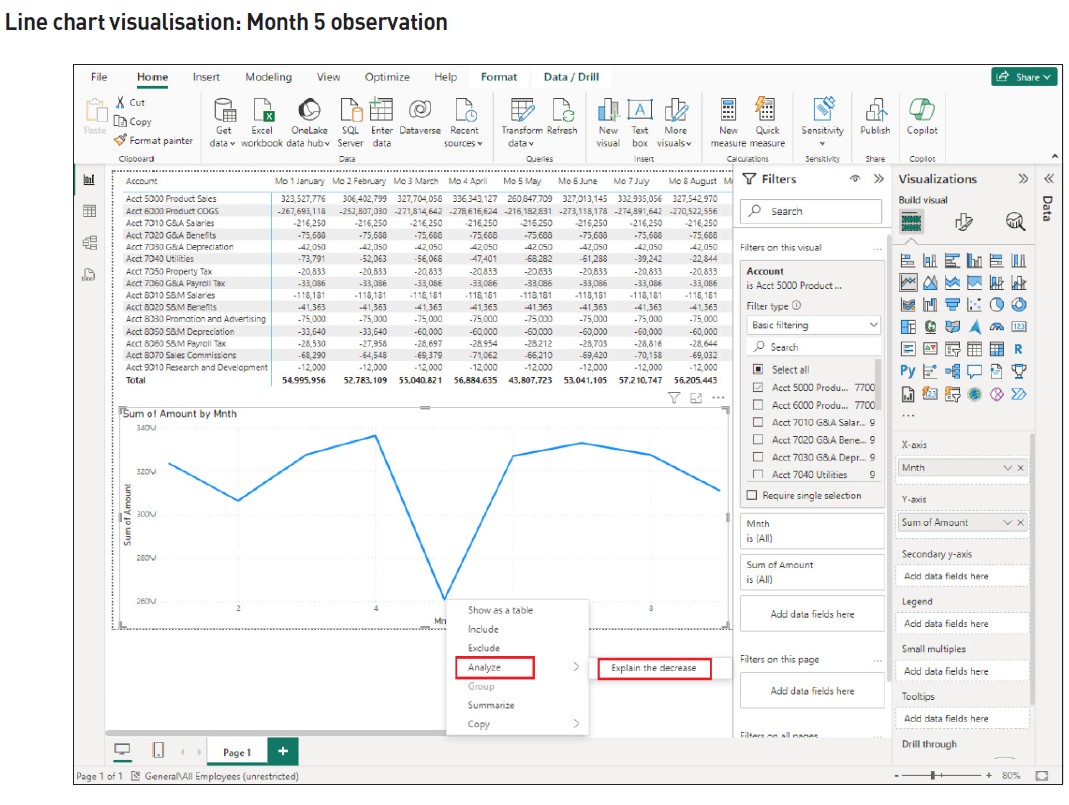
Power BI’s AI engine returns information called “Insights”. They are composed of categories that influence the selected point the most with respect to data provided to Power BI. These “Insights” quickly help us explore the root cause of the Pro Flight sales decline with information for data analysis purposes.
In the example, the insights returned include Sum of Amount (Sales):
- “By Mnth [month] and Product Line”;
- “By Mnth and Product”;
- “By Mnth and Day”;
- “By Mnth and Customer”;
- “By Mnth and Address”;
- “By Mnth and Sales Person”;
- “By Mnth and State”;
- “By Mnth and Country”;
- “By Mnth and Cust[omer] Type”; and
- “By Mnth and Discount Code”.
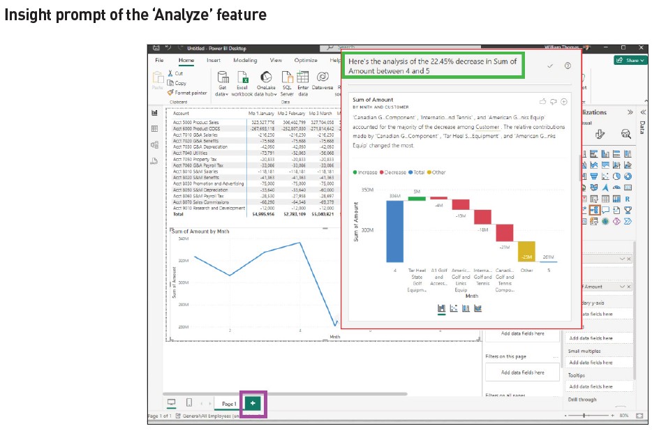
Note the summary information shown in the green box at the top of the “Insight Prompt of the ‘Analyze’ Feature” screenshot indicates “… the analysis of the 22.45% decrease in Sum of Amount between [month] 4 and 5.”
Step 2: Review the results
Based on its machine learning algorithms, Power BI quickly generates the previously noted “Insights” affecting the “Sum of (sales) amount” automatically. Power BI’s AI analysis provides ten insights addressing the decrease in sales using the “Analyze” feature. We can review each insight to pinpoint which are most useful in determining the root cause of the sales decline.
By scrolling down the “Insights” provided, we find the following:
- (“By Mnth and Product Line”) Cord shows the largest product line decline of $103 million.
- (“By Mnth and Product”) Half cord shows the largest decline of $51 million.
- (“Sum of Amount By Mnth and Customer”) Canadian Golf and Tennis shows the largest customer decline in sales of $21 million (as shown in the red box, see “Insight Prompt of the ‘Analyze’ Feature” screenshot).
- (“By Mnth and Sales Person”) Judy shows the largest decline by salesperson of $39 million.
- (“By Mnth and State”) Ontario shows the most significant decline for state (region) of $15 million.
- (“By Mnth and Country”) The US shows the largest decline for countries of $54 million.
- While other insights exist, these would be considered the most relevant for decision-making purposes.
‘Decomposition Tree’
Step 1: Select the visualisation
While the “Analyze” feature quickly provided a high-level analysis, we can further discover how the “Insights” relate to one another by using a “Decomposition Tree”. This visualisation will provide a more detailed explanation of root causes in May’s sales decline.
Let us investigate by first adding another page to our Power BI analysis. To add “Page 2”, click the “+” in the purple square to the right of “Page 1” as shown at the bottom of the screen in the “Insight Prompt of the ‘Analyze’ Feature” screenshot.
While the $75,495,418 million decline in sales from April to May has been quickly analysed using insights from the “Analyze” function, a “Decomposition Tree” will provide further information as well as aid in determining answers to the primary cause of the May sales decline. Power BI’s “Decomposition Tree” visualisation provides the ability to “decompose” or break down fields added to the visualisation. Since we learned that customer Canadian Golf and Tennis had a significant decrease in sales in May, let’s further analyse what product line, product, and salesperson were responsible for the decline.
To prepare a “Decomposition Tree”:
- Click on the Page 2 blank canvas.
- Click on the “Decomposition Tree” icon (see red square in the screenshot “Page 2 ‘Decomposition Tree'”). Note the “Decomposition Tree” visualisation now appears on the canvas area (outlined in the blue box on the “Page 2 ‘Decomposition Tree'” screenshot).
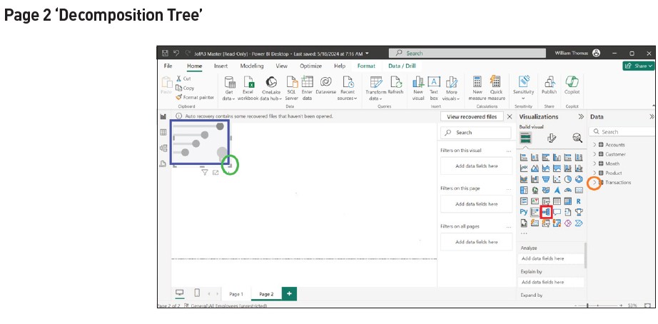
- Click on the blank “Decomposition Tree” visualisation shown in the blue box.
- Left-click on the bottom right angle shown in the leftmost green circle and extend the visualisation to the bottom right area to cover the canvas area.
Step 2: Selecting fields to be decomposed
Next, we define the visualisation for analysis by selecting the fields to be decomposed for further investigation:
- Click on the right arrow (shown in the orange circle of the “Page 2 ‘Decomposition Tree’” screenshot) located to the left of the “Transaction” file name in the “Data” pane to display the fields for the “Transaction” file.
- Next, left-click, drag, and drop “Amount” from the “Transaction” file directly into the “Decomposition Tree” visualisation located on the canvas. The “Decomposition Tree” visualisation will show “Sum of Amount.”
Continue to add fields directly to the “Decomposition Tree” visualisation by:
- Left-clicking, dragging, and dropping each of the following tables into the “Decomposition Tree”:
- From the “Transactions” file, the tables “Month” and “Sales Person”;
- From the “Customer” file, the tables “Cust Type” and “Customer”; and
- From the “Product” file, the tables “Product Line” and “Product”.
Step 3: Filter the data
The next step in this process is to filter the fields selected to include only sales data. To filter the sales amount for May:
- Left-click, drag, and drop the “Account” field (from the “Transaction” file) into an “Add data fields here” box located under the “Filters” pane as shown by the green box in the screenshot “Decomposition Tree Visualisation”.
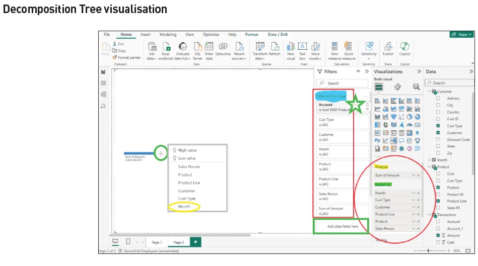
- Move your cursor over the “Account” filter and click on the down arrow as shown in the screenshot in the green star. Select “Basic Filtering” and click the box to the left of the “Acc 5000 Product Sales” field.
Your visualisation should appear as shown in the “Decomposition Tree Visualisation” screenshot (with the exception of the grey box explained below).
Note that the “Amount” field appears as “Sum of Amount” in the “Analyze” section highlighted in yellow in the “Visualizations” pane. In contrast, the “Month”, “Cust Type”, “Customer”, “Product Line”, “Product”, and “Sales Person” fields appear under the “Explain by” section highlighted in green and in the “Filters” pane along with the “Account” and “Sum of Account” fields under “Filters on this visual” highlighted in blue.
Step 4: Decompose selected fields
Because we know from the “Insights” section that customer Canadian Golf and Tennis had a significant decline in May sales, let’s investigate the root cause of this customer activity for specific products and salespeople associated with them.
To accomplish this:
- Click on the “+” sign shown in the green circle to the right of the blue bar, which is over “Sum of Amount” in the canvas area. A table of fields to select will appear as shown in the “Decomposition Tree Visualisation” screenshot in the grey box. Selecting one of these fields allows us to drill down or “decompose” the detail to a lower level. This “decomposition” can be repeated until all fields have been used.
- Continue by clicking the “Month” field circled in yellow.
The results to this point are shown in the “Decomposition Tree Expanded to Analyse Observed Data” screenshot.
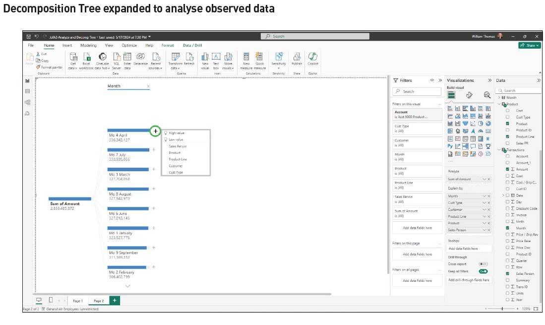
From the results, follow the below steps:
- Find “Mo 4 April” and click on the “+” circled in green in the “Decomposition Tree Expanded to Analyse Observed Data” screenshot, to the right of the blue bar over the top of its title.
- Click on the “Customer” field.
- From the results, find “Canadian Golf and Tennis” and click on the “+” to the right of the blue bar over the top of its title.
- Repeat this process by:
- Selecting the “Product Line” field, clicking “+” beside “Cord”.
- Selecting “Product” and finally clicking “+” beside “Full Cord”.
- Selecting “Sales Person”.
Step 5: Analyse the Decomposition Tree
At this point, we have an expanded Decomposition Tree that breaks down each of the selected fields into the composition of additional fields. Based on this detail, we can analyse the information for April and compare it to May very easily. (See the screenshot “Decomposition Tree Further Expanded to Analyse Observed Data”.)
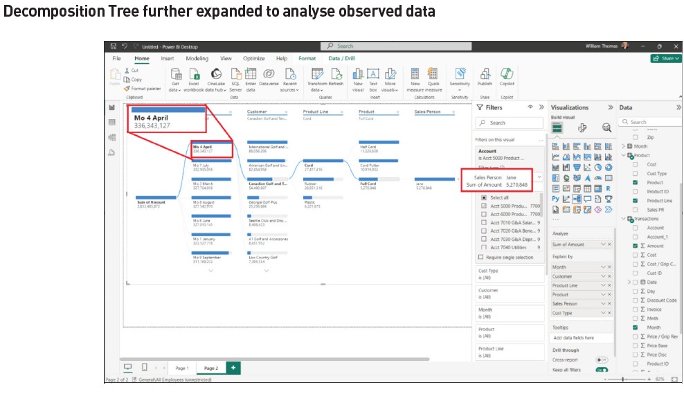
From this visual, we can see that Jane was the salesperson assigned to Canadian Golf and Tennis, and full cord sales for April were $5,270,848 (scroll your mouse over Jane’s blue bar to see the white box detail). To compare to May, click on the “Mo 5 May” selection under the “Month” column, where we find Jane’s sales of full cord to Canadian Golf and Tennis were $1,457,672 (shown in the green box of the “Decomposition Tree: Comparison Mo 4 April to Mo 5 May” screenshot) — a decrease from April to May of 5.1% of the total decline.
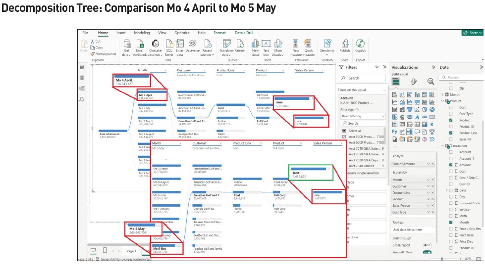
While not shown, the same model can be used to determine the impact of sales lost from the cord putter product by clicking on “Mo 4 April” under the “Month” field column, followed by clicking on “Cord Putter” under “Product”. Jane is the salesperson for this product, with sales in April of $10,919,932. Clicking on “Mo 5 May” under the “Month” field column, we learn Jane’s sales for May for cord putter were $6,186,016 — a decrease in cord putter sales in May of $4,733,916, representing 6.3% of the total sales decline in May.
The overall analysis shows that the root cause of the sales decline was this account. We then would want to inquire of the account’s salesperson, Jane, as to what happened and why the sales dropped.
Finding ideas to recover lost sales
Once we, as Pro Flight’s accountants, determine the underlying causes of the problem and begin work to address them, the need for possible means of recovery may be desirable. A way to discover impacts either to increase sales or decrease sales is to use Power BI’s “Key Influencers” feature.
Power BI’s “Key Influencers” visualisation is a robust feature that aids understanding of how attributes drive (or “influence”) a specific attribute. This visualisation analyses data and explains their impact as significant factors affecting the data as individual “Key Influencers” and groups (described in Power BI as “Top Segments”) and their respective influencers.
The visualisation is customisable, allowing users to filter the visual and show the remaining values considered influencers by virtue of Power BI’s AI selecting key data.
In the following example, we will use “Key Influencers” to determine “What (attributes) influence (sales) amounts to increase?”
Construct a “Key Influencers” visualisation by:
- Adding another page (click the “+” to the right of “Page 2” at the bottom left of the screen to add “Page 3” as illustrated previously).
- Click on the blank canvas area. Select and click on the “Key Influencers” visualisation icon under the “Visualization” pane in the “Decomposition Tree: Comparison Mo 4 April to Mo 5 May” screenshot.
- Expand the visualisation area as done previously by left-clicking on the right angle at the bottom right of the blank visualisation and drag down and to the right. (Refer back to the “Page 2 ‘Decomposition Tree'” screenshot, if needed.)
As changes are added, the “Key Influencers” begins to take shape. (See the screenshot “Construction of Key Influencers Visualisation”.)
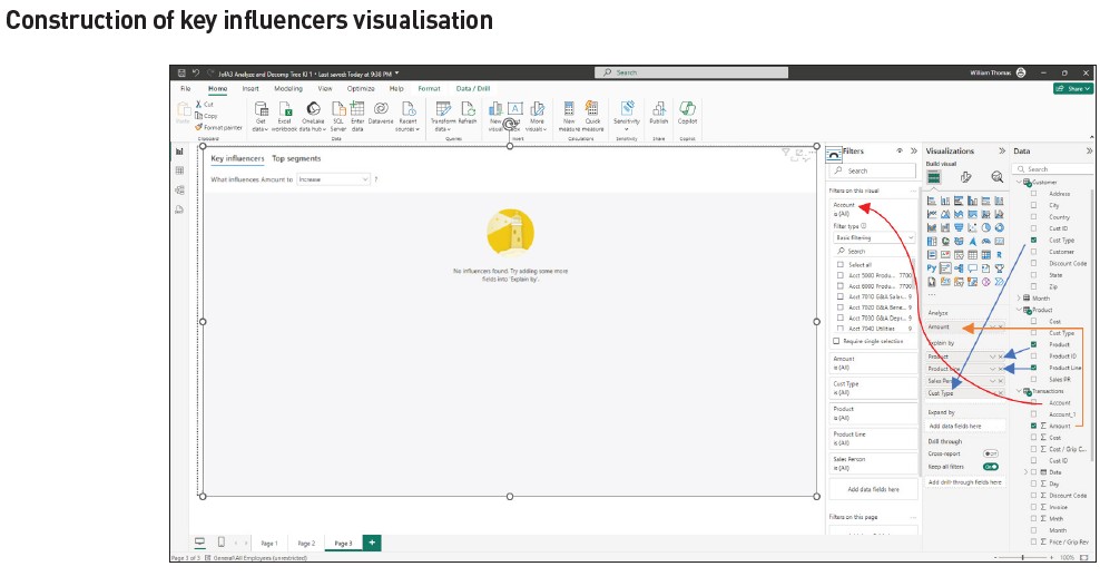
Because the goal is to “Analyze” (sales) amount, left-click, drag, and drop the “Amount” field under the “Transactions” file and release in the “Analyze” box reading “Add data fields here” located in the “Visualizations” pane (shown in the screenshot “Construction of Key Influencers Visualisation” with the orange line and arrow).
- To select the attributes by which sales amount will be influenced, left-click, drag, and drop the “Product” and “Product Line” fields from the “Product” file to the “Explain by” box (shown by the blue arrows in the screenshot “Construction of Key Influencers Visualisation”).
- Repeat the process to click, drag, and drop the:
- “Sales Person” field from the “Transactions” file.
- “Cust Type” and “Customer” fields from the “Customer” file.
- The “Account” field from the “Transaction” file to the “Filters” pane under “Filters on this visual” in a blank “Add data fields here” box (shown in the screenshot “Construction of Key Influencers Visualisation” with the curved red line).
- Select “Basic filtering” under “Filter type.”
- Click on “Acct 5000 Product Sales” to filter the data. (Since we are analysing influencers on all sales, we will not restrict the visualisation to the month of May.)
The “Key Influencers” visualisation is shown in the “Key Influencers Visualisation: Top Segments” screenshot. Note the visualisation created shows “What influences Amount to” either “increase or decrease” Amount. On the left side of the visualisation, under the “When” column shown in the green box, find “Product is Full Cord” and click on the circle that shows “190.4K” to the right of the arrow on the same line. The resultant graph to the right shows “Full Cord’s” impact on increasing sales. The visualisation indicates “When Product is Full Cord the Average of Amount Increases by 190.4K.” Other “influencers” are also shown.
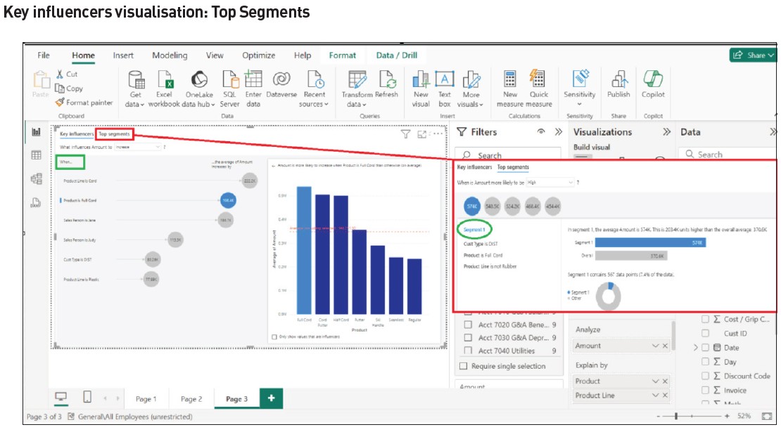
The previous screenshot also shows the “Top Segments” selection result, which are combinations of attributes and values that make up the segment identified.
To see the “Top Segments”:
- Click on “Top Segments” shown in the red box at the top. Note that five segments are shown with “Average of Amount” and “Population Count” statistics.
- Next, click on the blue circle with “574K” inside (associated with the “Segment 1” observation).
The result (shown in the large red box in the screenshot “Key Influencers Visualisation: Top Segments”) indicates group or segment influences. For example, “Segment 1” depicted in the green circle shows the “Amount is likely to be high” when “Cust Type is DIST, Product is Full Cord, and Product Line is not Rubber”. The impact of this combination is 203.4K units (dollars) higher than the overall average, 370.6K. This suggests the most likely way to increase sales is to focus marketing on sales to distributors of full cord products, not rubber. Note that segments are defined when an attribute exists (example “Cust type is DIST”) and also when an attribute does not exist (example “Product Line is not rubber”).
In summary, through using Power BI’s built-in AI, we could determine:
- Canadian Golf and Tennis was the customer with the largest decline in sales between April and May (using the “Analyze” feature).
- The product line and product from which Canadian Golf and Tennis showed the greatest sales reduction were “Cord” and “Full Cord”, respectively.
- The most profitable ways in which we could compensate for a future reduction in sales would be to market “Full Cord” product to customer type “Distributor”.
Note that other observations and interpretations could also be made using the previous analysis.
Smart Narrative
Assisting with the writeup
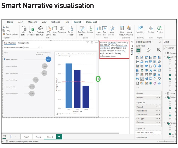
Power BI can quickly provide a text summary of all visualisations on a page or a selected visualisation on a page using “Smart Narrative” to explain results in natural language. Using the previous visualisation:
- Select the visualisation (left-click) and then right-click. A box appears with several options.
- Click on the “Summarize” option. Power BI provides two narrative type choices, “Copilot” and “Custom”.
- Select “Custom” and the summary appears.
- Resize the key influencers visualisation by right-clicking on the tab highlighted in the green circle and dragging to the left. (See the screenshot “Smart Narrative Visualisation”.) Position the summary in the blank area created.
For a more detailed example:
- Return to “Page 1” (by clicking on the “Page 1” tab at the bottom of the screen).
- Create space on the canvas by sizing down the income statement “Matrix” visualisation (click on the visualisation, click on the left sidebar, then drag to the left to make an open space — similar to the previous steps to “Resize the Key Influencers Visualisation”).
- Left-click on the open space created, then left-click and select the “Narrative” visualisation icon.
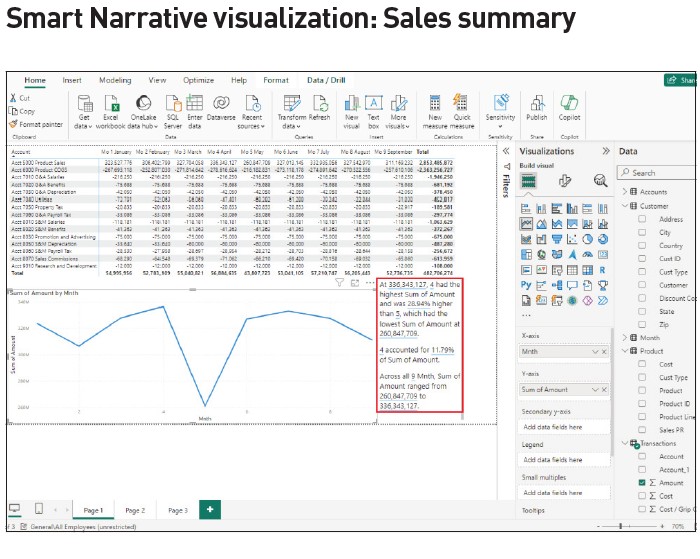
- Select “Custom” and the summary narrative for the line chart appears.
Note that the summary is dynamic and can be modified by selecting different data in the visualisations on the page. (See the screenshot “Smart Narrative Visualisation: Sales Summary”.)
While answers to the significant decline in sales from April to May were resolved quickly early on using Power BI’s AI, the examples that followed aid in discovering more facts about what led to the decline as well as to what influences an increase or decrease.
These are just a few examples of powerful AI features that can significantly aid the work of management accountants using data analytics.
William Stewart Thomas, CPA, CGMA, Ph.D., is a professor of accounting and former vice-chancellor, and Dena Dail Breece, CPA, CGMA, Ph.D., is an associate professor of accounting, both at the University of North Carolina at Pembroke in the US. To comment on this article or to suggest an idea for another article, contact Oliver Rowe at Oliver.Rowe@aicpa-cima.com.
LEARNING RESOURCES
Microsoft Power BI: Power BI Series
This nine-part self-study online series was created to help you develop the skills necessary to use Microsoft Power BI tools.
COURSE
Microsoft Power BI: Get Started With Power BI
The full spectrum of data analysis capabilities is examined for professionals who seek further understanding of Power BI capabilities and their integration with Excel’s Power Pivot and Power Query.
COURSE
AICPA & CIMA MEMBER RESOURCES
Articles
“Tips for Using the Power BI Suite of Tools,” FM magazine, 22 February 2024
“BI Tools: Power Query, Power Pivot, and Power BI,” FM magazine, 4 January 2024
“5 Steps to a Digitalized Reporting Dashboard,” FM magazine, 14 September 2022
“Are You Telling a Story With Data? You Should Be,” FM magazine, 13 September 2022
“Power BI: An Analytical View,” Journal of Accountancy, 1 March 2020


