


Sometimes, Excel’s built-in charts seem too plain, boring, or simplistic. Sometimes you want to create your own visual — and use it again and again. This is where creating your own chart template in Excel proves beneficial. It’s a relatively straightforward process, as I will demonstrate below.
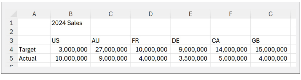
Imagine you have been tasked to create a bespoke chart to represent the following example sales data:
In this article, I am not providing a step-by-step walk-through to create a particular chart. The intention here is to create something that cannot simply be selected straight from Excel (so feel free to create your own visualisation).
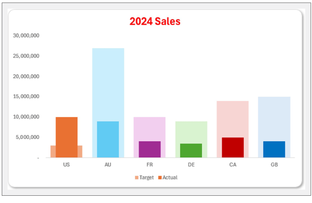
I have created a Clustered Column chart that shows the progress towards targets, and I have selected a different colour for each data point — see the screenshot below:
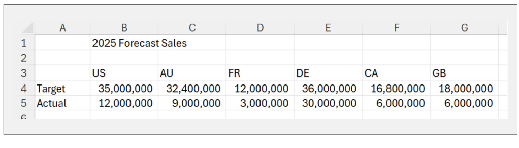
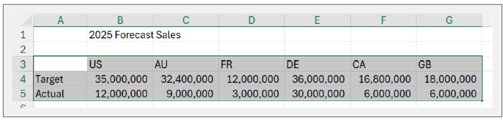
Management has decided it likes this chart (not quite sure precisely how many styling rules this has breached) and wants me to use it for next year’s sales forecasts — see the data example below:
I could copy the original Excel file and change the data in the table, but I would like this chart to be available whenever I want to use it. Therefore, I wish to create a custom chart for future use.
To do this, let’s start with the original Clustered Column chart where you can right-click to see the following shortcut menu:
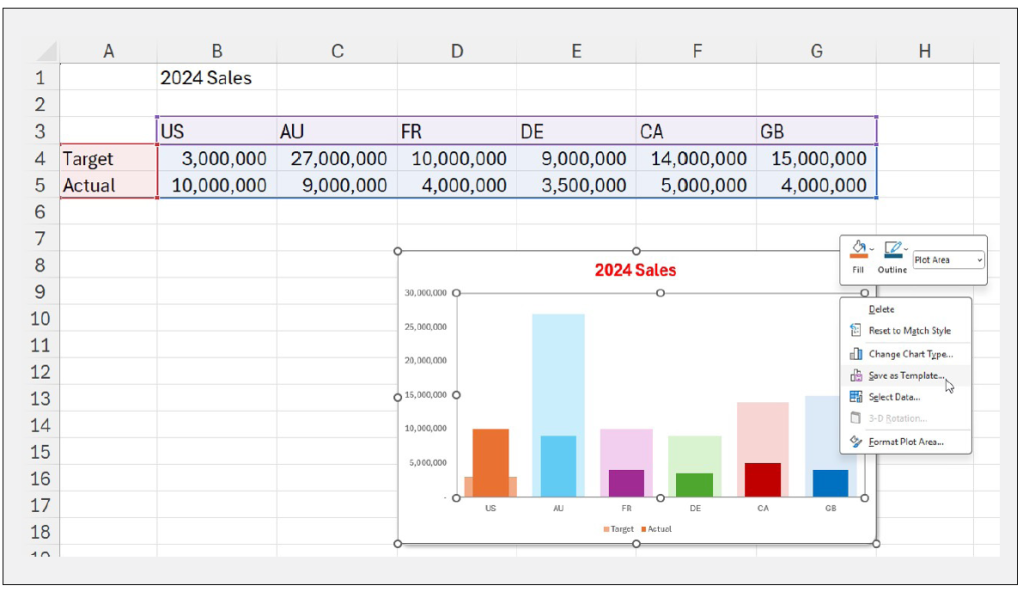
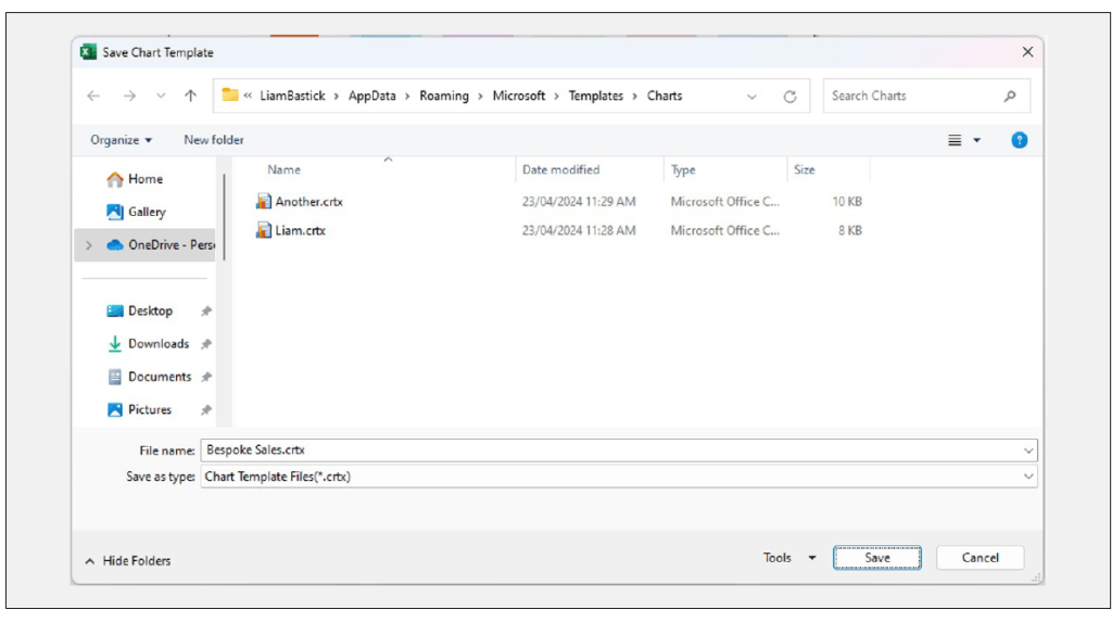
I choose the Save as Template… option, and a dialog box appears prompting me to save the chart — see below. I change the default file name to Bespoke Sales.crtx.
I may now return to the new data and select it all:
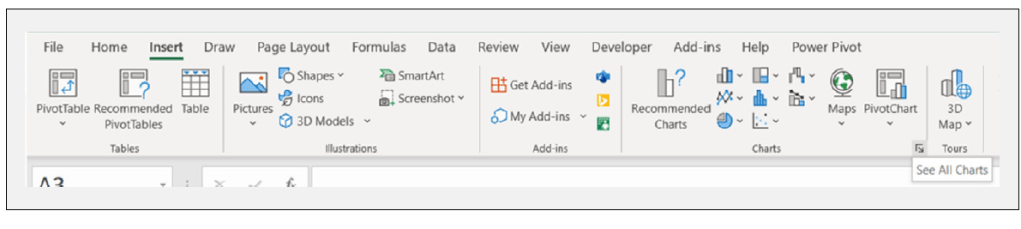
On the Insert tab, in the lower right-hand corner of the Charts section, there is an icon where I can See All Charts:
Clicking on this icon reveals an Insert Chart dialog box where I choose the All Charts tab:
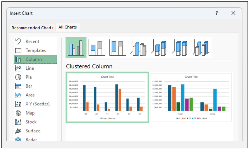
I then choose the Templates option (second item down in the left-hand column):
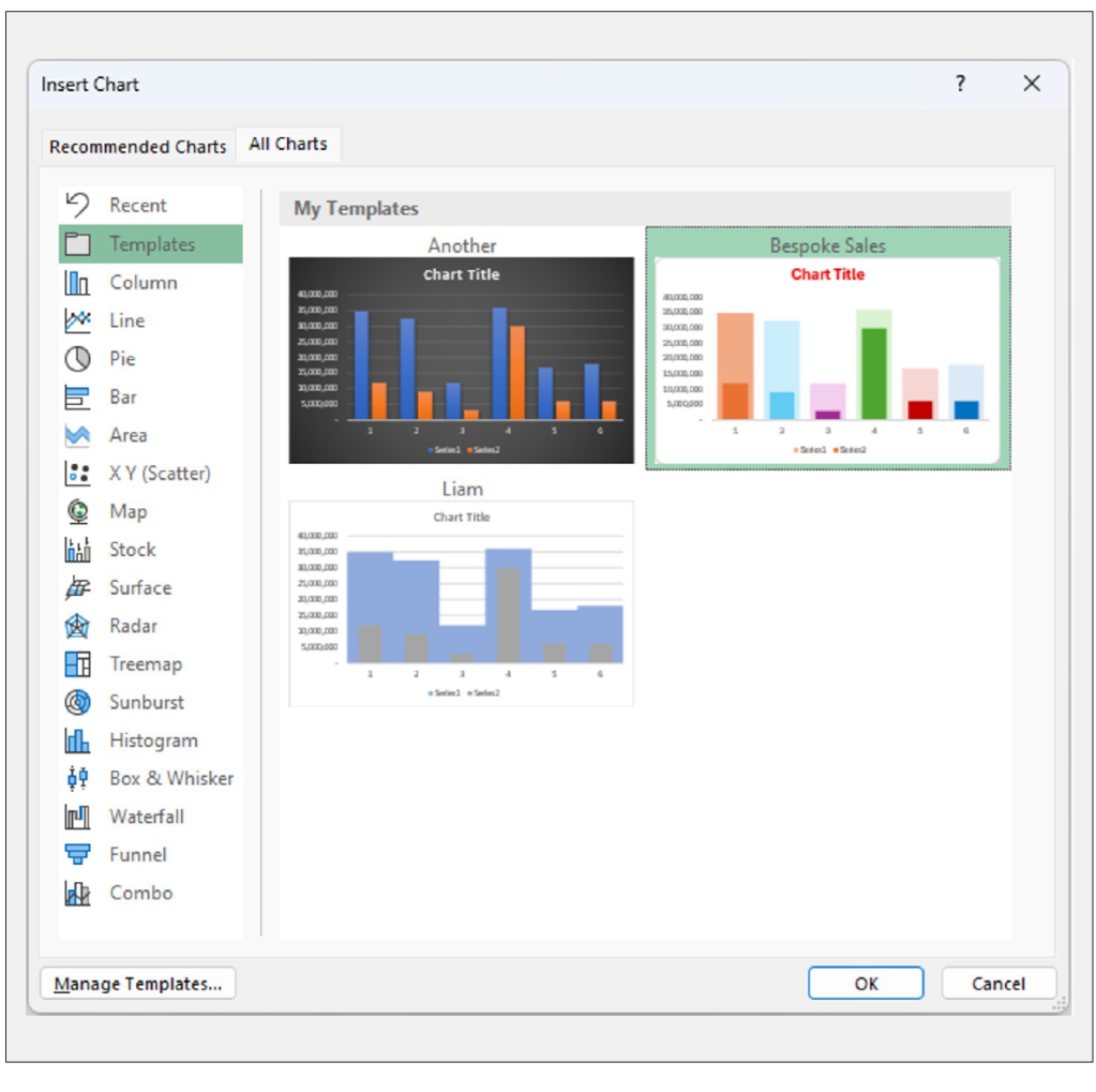
I can see the Bespoke Sales template under My Templates.
I can hover over the chart template to see an enlarged version:
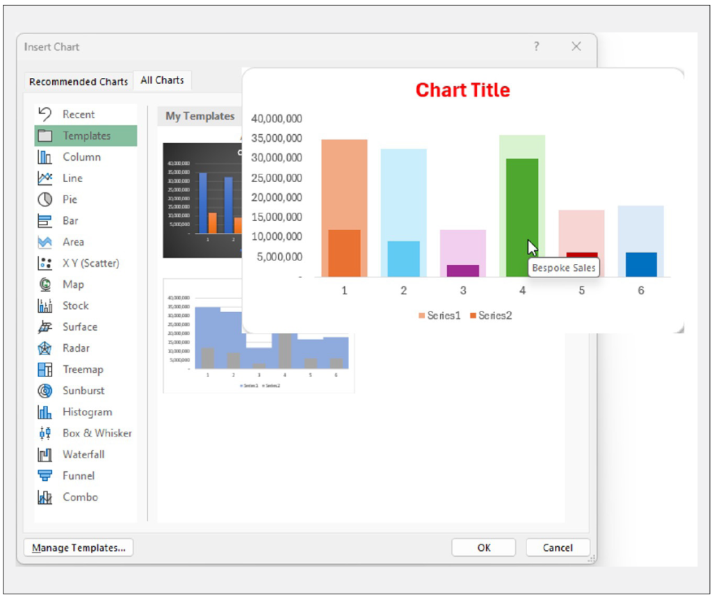
Note that there is also an option at the bottom of the dialog box to Manage Templates. This would take me to the Windows folder containing the templates should I wish.
I choose Bespoke Sales and click OK — with the result shown below:
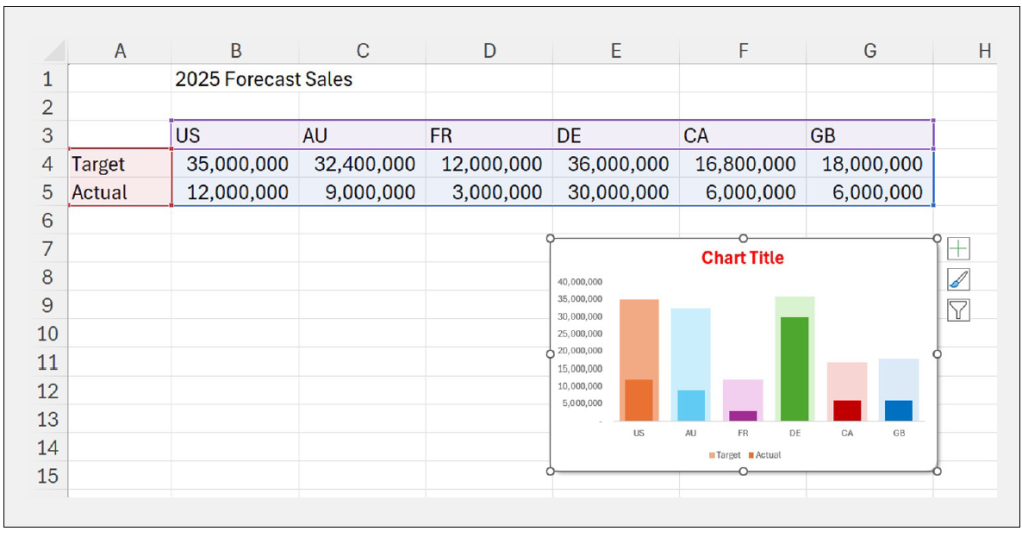
The formatting of the data series replicates the original chart created, and I can now add an appropriate chart title:
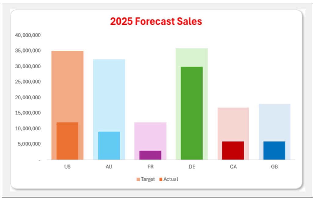
This template is now available on my device, allowing me to use this modified version of a Clustered Column chart.
To share this template with another user, I would need to send them the Bespoke Sales.crtx file, which they could then store in the Charts folder on their device. Simple.
Liam Bastick, FCMA, CGMA, FCA, is director of SumProduct, a global consultancy specialising in Excel training. He is also an Excel MVP (as appointed by Microsoft) and author of Introduction to Financial Modelling and Continuing Financial Modelling. Send ideas for future Excel-related articles to him at liam.bastick@sumproduct.com. To comment on this article or to suggest an idea for another article, contact Oliver Rowe at Oliver.Rowe@aicpa-cima.com.
LEARNING RESOURCES
Introduction to Data Analytics With Power Query (Get and Transform)
In this session, we will explore the basics of the Power Query add-in — extracting, transforming, and preparing data for analysis.
COURSE
Microsoft Power BI — Create Excel Dashboards for Maximum Impact
Learn how to build robust dashboards for analysing key metrics in Excel. The course begins with some dashboard design guidelines, such as understanding your audience and identifying necessary metrics, and shows how to create KPIs.
COURSE
MEMBER RESOURCES
Articles
“Excel: Using the Recommended Charts Feature”, FM magazine, February 2025
“Working With Images in Excel”, FM magazine, 19 December 2024
“How to Use Data Tables in Excel”, FM magazine, 11 November 2024
“10 Types of Excel Charts for Data Visualisation”, Journal of Accountancy, 1 October 2024
“How Excel Builds on Basic Principles to Assist Forecasting”, FM magazine, 28 August 2024
